The Hidden Language of Brands

Your brand talks to people before anyone finishes a sentence. A curve in a mark, the angle of an icon, the temperature of a palette: those cues land first. Someone feels trust, warmth, edge, caution, or distance in a few seconds, often before they could name why.
Shape and color are not decoration bolted on after the strategy deck. They are a pre-verbal dialect. Treat them as taste samples and the brand will look finished while still feeling arbitrary. Treat them as translation of a decided emotional tone and the visuals start to feel inevitable.
Shapes arrive before the story
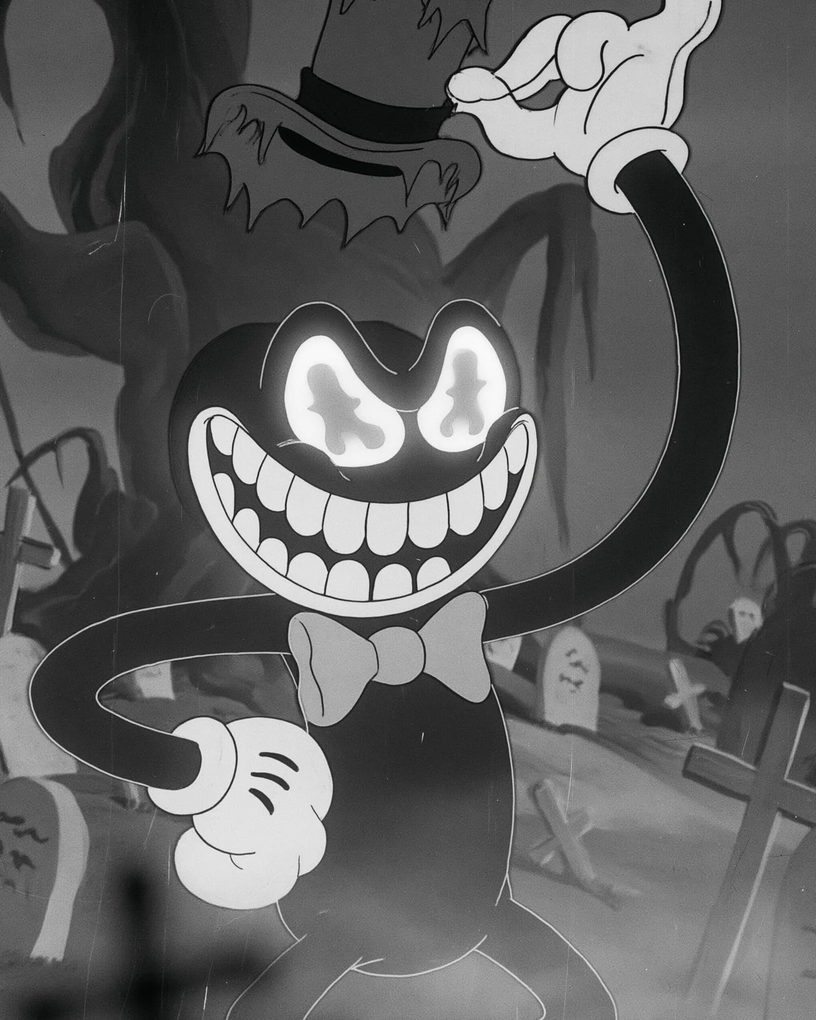
People assign meaning to forms faster than they parse copy. Soft curves and rounded masses tend to read as safer and more approachable. Sharp angles and jagged edges tend to read as precise, tense, or aggressive. Squares and straight structure tend to read as stable and orderly. None of that is a personality quiz. It is a coarse map of instincts designers already use in film, packaging, product, and character work because silhouette has to communicate before detail does.
You can see the map exaggerated in characters built to be readable at a glance. Maleficent is almost all point and angle: horn, cloak, claw. Even as a shadow the outline threatens. Mario is curves, hat, and a friendly mass that invites rather than warns. SpongeBob is square and rectangular enough that the silhouette itself feels orderly and dependable. Those are storytelling choices, not random style. Branding borrows the same grammar when a mark or icon system needs to signal something before the tagline gets a turn.
In mark and system work the question is narrower than "which shapes are cool this year." It is whether the forms reinforce the attributes you actually want to own. Edge and precision want sharper geometry. Care and approachability usually want softer ones. Stability and reliability often want structure you can feel in the grid and the mark. When the geometry fights the claim, people feel the mismatch even if they cannot lecture you about contour psychology.
Dissonance is the expensive tell
Wrong shape language creates a quiet distrust. A wellness brand built on aggressive angles can feel cold while the copy keeps promising gentleness. A product that wants to feel technically serious can look soft and safe if every form is rounded into friendliness. The homepage may still convert under urgency. The brand will not feel coherent when someone has to choose you without a salesperson narrating the intent.
Alignment is the boring word for a useful test. Hold the mark, the icon set, and one key layout beside the one-sentence emotional tone you claim. If a cold reader would not guess that tone from the forms alone, the visuals are still guessing. Fixing that is not "making it prettier." It is making the pre-verbal layer stop arguing with the verbal one.
Color turns the volume up
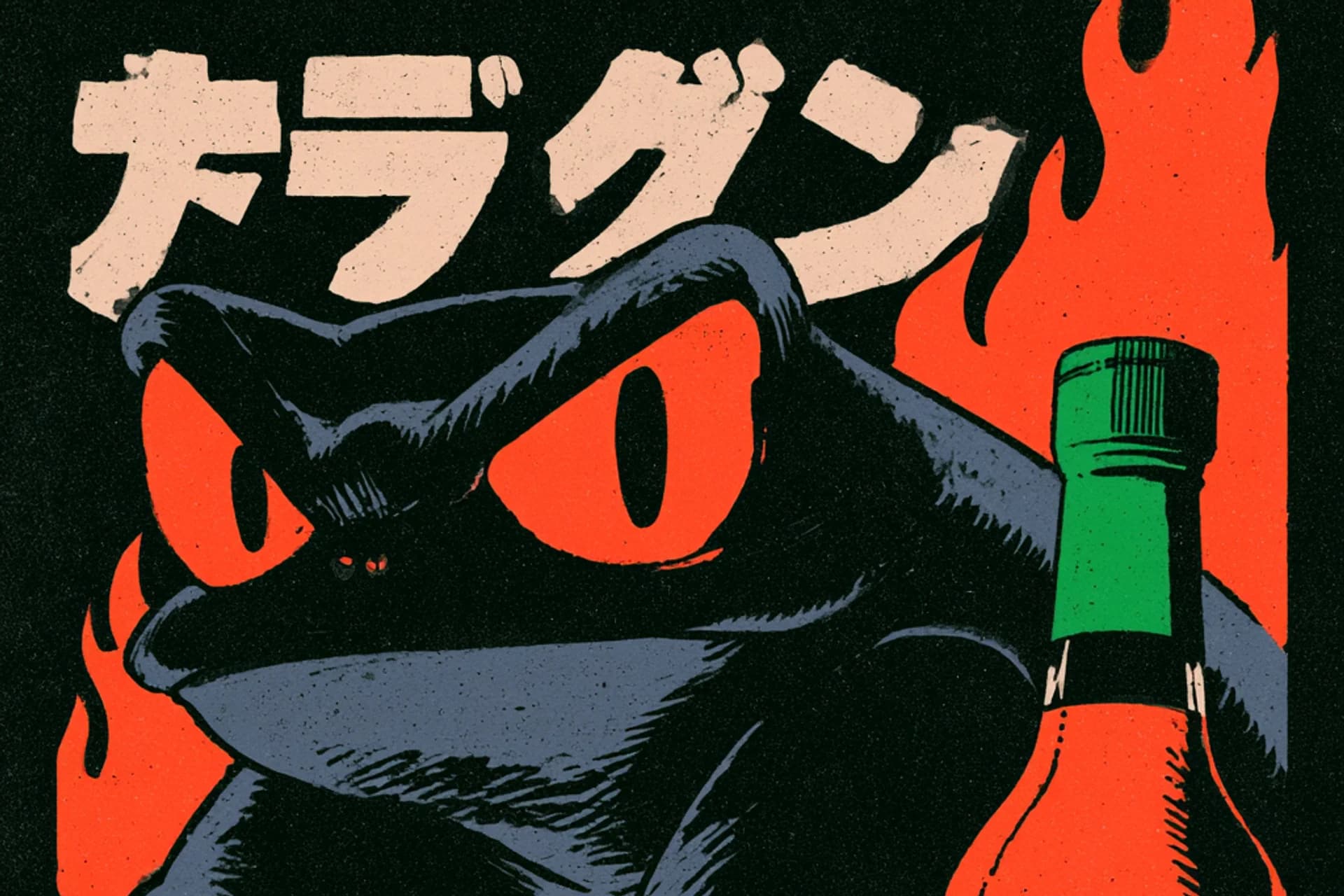
Once the geometry has a job, color amplifies it. Blues often carry calm and clarity. Warm reds and oranges carry energy and urgency. Greens lean growth and care. Deep neutrals can read as serious or mysterious when they are used with restraint. Soft pastels lean gentle and approachable. Those associations are familiar because they keep showing up in work that has to persuade quickly.
Color does not invent a personality the shapes refused. If the forms say threat and the palette says spa, the identity feels confused. If the forms say warmth and the palette is all severity, the same problem shows up in reverse. The useful discipline is pairing: choose color to support the emotional tone you already decided, not to rescue a mark that never had one.
Decide the feeling before the moodboard
It is easy to jump to the fun part: picking swatches, shaping logos, building boards. When that happens before anyone can name the emotional tone, the attractions, and the refusals, the visuals rarely carry weight. They look like preferences. Preferences do not hold up under a redesign, a new hire, or an AI draft that needs a constraint.
Stronger work starts by uncovering what should feel true in the first seconds, then letting shape and color become extensions of that decision. Logo, type, photography direction, and the site stop being a pile of tasteful parts and start agreeing with each other. Find the why first, then give it a silhouette and a temperature people can feel without a brochure.
You do not need a textbook on subconscious branding to use this. You need an honest cold look at whether your forms and colors already say what you claim, and the willingness to change the ones that fight. Brands that feel right at a glance are usually the ones where the instinctive layer and the rational layer are doing the same job.
If you are ready to lock that pre-verbal dialect before the next mark system or site rebuild, start with branding and strategy, or contact with the feeling you want a stranger to get before they read a word.



Tell us what you're building
Discover. Define. Design. Scale — from ambition to a brand system that can travel.